Wait – don’t go! You’re in the right place. I know everything looks different but it’s still me, and my happy crazy life.
Why?
Well, I liked the theme but was getting tired of it. And I decided that since my blog encompasses all facets of my happy crazy life the design should too. Most of all it was Pietra’s fault.
Who?
Pietra of Homestead Emporium. She’s been a fellow Lily Pad Landing artisan and friend for years. I was reading her blog and loved how the simple design highlighted her photos instead of distracting from them.
Of course with me nothing is as simple as downloading a theme. I felt her theme was a little too simple for what I had in mind. I wanted a 3D look with shading around the main area, and of course I couldn’t give up purple entirely. So I went on a quest to find a new theme.
To make a loooooooong story short, I searched, searched, searched some more, found one I could work with, then spent months customizing it. Literally, months! I collected design bits and pieces all over the internet and put them together – kind of like Frankenstein but without the torch and pitchfork-bearing neighbors.
Why not just design my own theme?
Ha-ha-ha-ha-ha! Soooo funny! I know enough html and css to be dangerous, but that’s it. I don’t know php, which is the language needed for a blog, so I had to find a foundation to built on.
Wanna take a tour? Follow me…
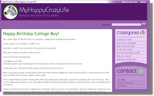
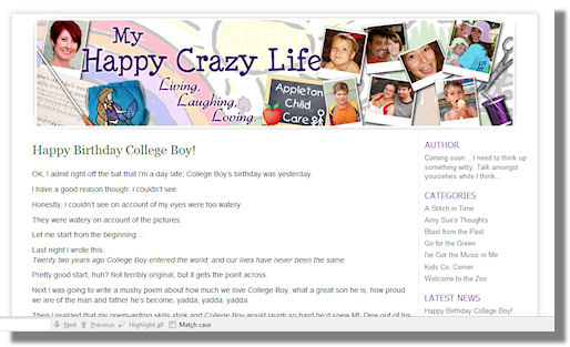
First off you’ll notice the purple theme has been replaced by white. Much easier on the eyes, and it really makes the photos pop.
Next take a look at the gorgeous header at the top. It was created by my friend Tina of Joyful Rose. I made one myself, but couldn’t get it quite the way I wanted so I handed it off to her. She did a fantastic job as usual.
You’ll notice that I kept the sidebar on the right as before. It’s better for SEO search engine optimization reasons, and leaves nice wide content area. I can’t stand blogs that are so cluttered on both sides that you can barely concentrate on what you’re trying to read.
The sidebar itself has been tweaked. One of the coolest additions is a plugin my friend Michelle of Creo Communico clued me in to. It’s called Lifestream and will display your “social media” and photos automatically. How cool is that?!
Notice the cute little pencil and comment bubble graphics? I won’t admit how many hours it took for those, but I think they’re totally worth it. There’s a couple other cute little graphics on other pages – have fun discovering them on your own!
Old:
New:
I totally love it – what do you think?






Nice job Amy Sue. I really like the new look – simple and clean with your lovely family in the header. Pat