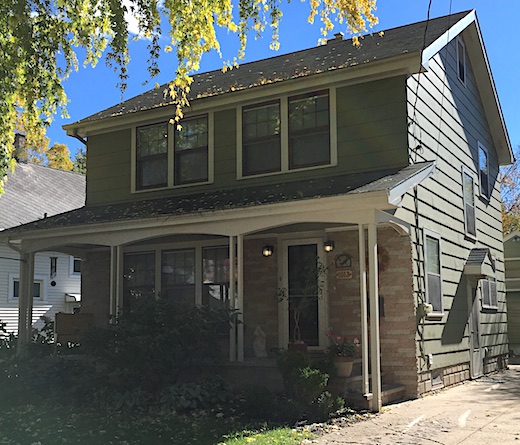
 Several years ago when the house needed to be repainted Teacher and I decided it was time to change the grey/burgundy/cream color scheme. The house was built in 1922 and we both love 1920s Craftsman style so Teacher suggested I search online to see what colors 1920s bungalows were painted.
As we debated paint color we also dreamed about how we’d like to remodel our house if we had the time and money. Although we both love Craftsman bungalows, we love this house too much to move so we decided to bring in 1920s features whenever we could.
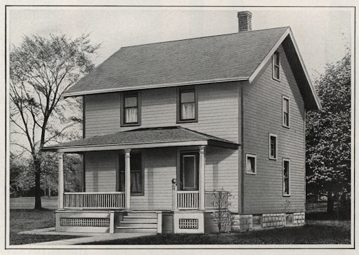 We decided on green for the main color so I searched online for 1920s green exterior paint color schemes and stumbled onto a fantastic Flickr account, The Daily Bungalow. Although I’d started browsing green color schemes, I soon drifted into floor plans and was surprised when a house that looked like ours caught my eye.
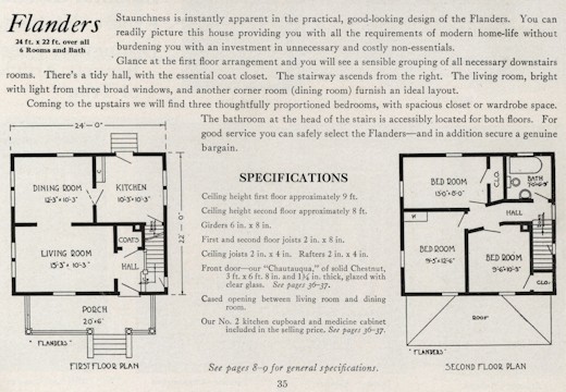 It was a “kit home” called “Flanders” by the Ray H. Bennett Lumber Company of North Tonawanda, NY. According to Antique Home Bennett kit homes can be found in the upper Midwest – that’s us!
I took a closer look at the floor plans and was amazed at the similarities.
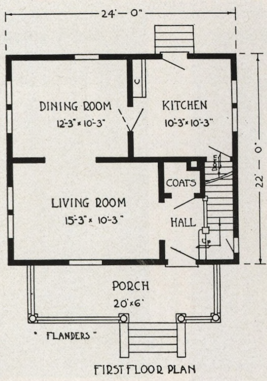 Here’s a close-up of the 1920s main floor plan.
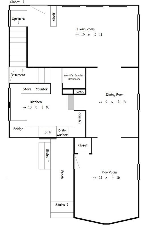 Now compare that to the plan I made of our main floor for a class many, many years ago. Just ignore the part on the bottom – Play Room, Closet, Porch, etc. They were added in the 1960s.
I know it’s kind of hard to tell so I flipped the original plan to make it easier to compare:
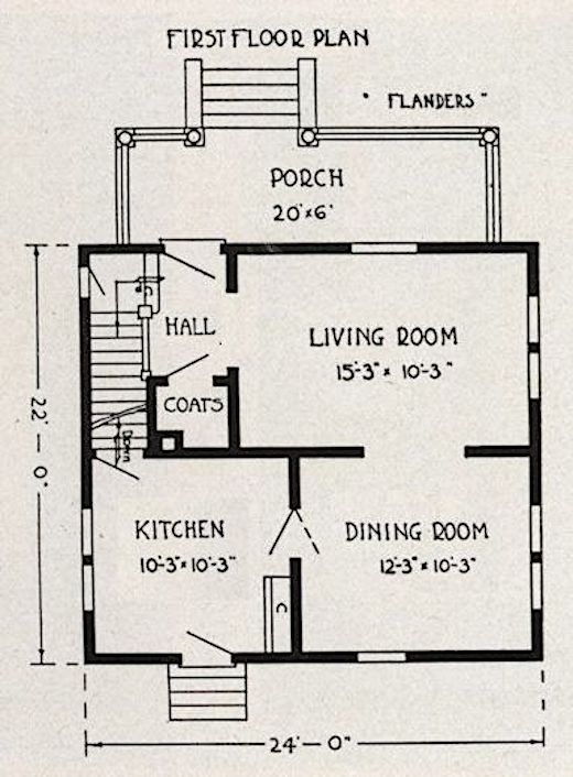 Here’s the original again. And…
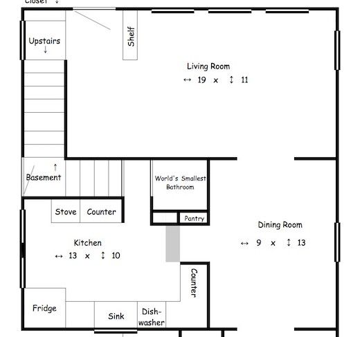 My floor plan without the 1960s addition.
Now what do you think? It’s not exact, but it’s awfully close! It’d be even closer if I’d used actual measurements for my floor plan instead of rounding up to the nearest foot.
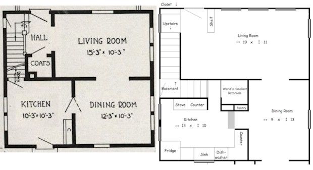 Here’s an almost side-by-side comparison. Can you see it too? It’s so close!
At first I couldn’t figure out the stairs/bathroom area because what we have doesn’t match the plans at all. Then I realized that it looks like the builder cut the 1920s plan in half and added three feet in the middle to make room for the turn in the stairs and the World’s Smallest Bathroom. That also explains why our dining room is 3′ longer than the 1920s plans. I don’t know if there would’ve been a first floor bathroom in the 1920s, but maybe!
Some of the reasons I think our house was based on the Flanders plan:
- The Bennett catalog where I found the Flanders plan, #18, was published in 1920 and our home was built in 1922. Two years seems like a reasonable time frame to me for a house plan from New York to be used as the basis of a home in the Midwest.
- The windows are in the same place on both plans, although the 2016 home has more windows overall. When we moved in all of the windows in the original part of the house were wavy glass so I assume they were 1920s originals. We’ve broken some over the years but hope to replace them with wavy glass someday.
- In the living room, the 2016 built-in shelf is exactly where the wall on the 1920s plan is, and seems to be the same length. I can’t wait to rip up the living room carpeting to uncover the original flooring and see if there’s any indication of a coat closet!
- The door to the 2016 playroom is where the 1920 dining room window was. And there’s a dark line on the original floor across the doorway which makes me think that there was a full wall there once. There’s a photo in my Summer Vacation Day Six & Seven post.
- The 2016 kitchen window over the sink is exactly where the 1920s back door was. I wish there was an easy way to see if there used to be a door there. If I’d had these plans when we first remodeled the kitchen I would’ve tried to see, but I’m not ripping any cabinets out now!
- Our dining room is narrower and our kitchen is wider than the 1920s plan, but I think the kitchen was expanded in the 1960s remodel. The front (kitchen-side) of the counter between the dining room and kitchen is where the wall between those rooms is on the 1920s plan – exactly 12 feet from the opposite dining room wall. The cabinet is 3 feet wide so, so it makes sense that the dining room would be 3 feet narrower if that’s what they did.
- Along the same lines, the wall of the pantry lines up exactly with the front of the kitchen counter, the plain wood in the floor the grey box on the plan, and the ceiling soffit. Scroll toward the bottom of Summer Vacation Day One to see a photo of the floor in front of the counter.
- Finally, front of the counter lines up with the wall of the addition. I don’t know if that proves that the wall was originally where the front of the kitchen counter is now, but it seems like quite the coincidence.
Pretty convincing, huh?!
Some of the things that are different:
- The 1920 stairs lead right into the kitchen but our stairs turn toward the bathroom. The floor there seems to be the 1920s original so I don’t think that was part of the 1960s remodel. You can see the landing in the last photo of the Days Six & Seven post.
- The boards mentioned in #5 above make me think the door to the kitchen was where our counter is now rather than where indicated on the 1920s plan. There’s no way to tell without ripping out the cabinets, and I’ve already said we’re not up a major kitchen redo anytime soon, even though I’m dying to find out what’s under the cabinets. No Amy Sue! No tearing out the cabinets!
- I can’t figure out what would’ve been where our bathroom is now, and whether the pantry was original or added in the 1960s. I’m guessing it was added, but every time I consider what a big job it would be to pull up the particle board i.e. Take everything out, including the shelving, then put everything back in again I decide I don’t want to know that badly.
- The 2016 dining room is longer than the 1920s plan. But since the extra 3 feet matches the width of the stairs leading to the bathroom I really think three feet were added to the middle of the plan.
- The short window on the side of the 1920s house is a full window on our house. It’s not a big deal and is in keeping with the fact that the whole house has more windows than the original plan, but it’s still a difference.
- We also have a door that isn’t in the 1920s plan, but is in the three feet I think were added to the middle of the house.
- The porch is very different from the 1920s plan, but I know that was changed in the 1960s because there’s a 1968 penny stuck in the cement. I’d love to redo the porch and give it more of a 1920s feel, but the brick was laid on top of the concrete porch floor so it’ll be harder and more expensive to redo. We got a ballpark estimate from a concrete guy once and it was so high I blocked it out of my memory.
When I can’t get to sleep at night I imagine how I’d remodel our house if we won the lottery which would be quite the miracle since we never play, so I have a whole list of things I’d love to do. Things like residing the whole house in narrow wood siding, ripping out the porch and building a new one in 1920s style, replacing all the windows with wavy glass, ripping out all the ugly interior trim and hollow doors and installing in Bennett-style trim and paneled doors. More to come on that subject… Usually I fall asleep by this point, which is a good thing because there’s no telling what else I’d dream up!
How does the second floor compare?
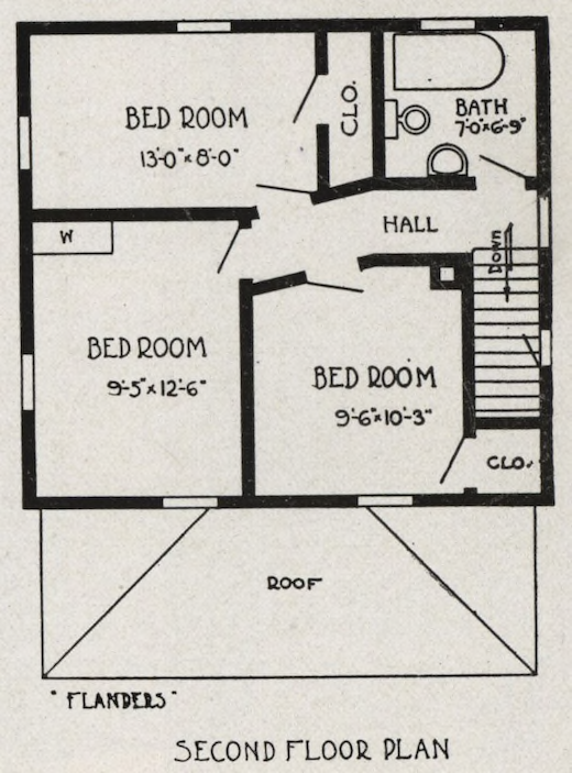 Well, here’s a close-up of the 1920s plan. I didn’t have to do the second floor for that class so I don’t have one yet, but I plan to do one in the near future.
Like the main floor, it’s not exact, but there are obvious similarities!
Have you ever looked into the history of your home?


